2021 | Seven and SonsGraphicDigitalWebsiteBranding
Seven and Sons – hospitality group with a hunger for fun
A group of awesome friends who are united by the sincere goal to make people happier through great hospitality.

When the boys of Seven & Sons came to visit us in our Tartu office across the yard, we knew immediately that something special would be born of this cooperation – this was our opportunity to create something awesome in our hometown of Tartu. Boys’ desire was to unite their current (and future) eateries and bars and create a new hospitality group.
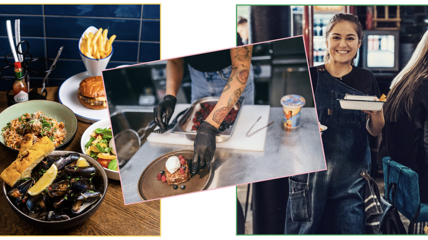
We first did a Brand Sprint team exercise to define what the group’s main values, ambitions and motivations are.
Then, we went and experienced it in real life, ie. we spent countless lunch breaks and weekends enjoying Kolm Tilli pizzas or Pepe’s pancakes and cocktails. This helped us to map the identity of each restaurant and bar in the group and to direct our thoughts about what the umbrella brand should look like.
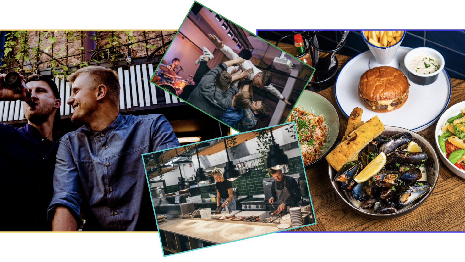
“United by desire to make people happier through shared experiences.”
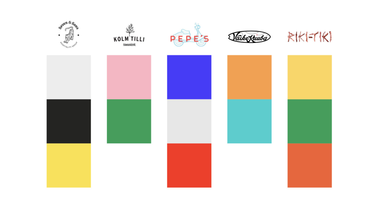
We chose dark and light grey and yellow for the brand colors; dark grey symbolises softness and worn jeans, yellow again emotion and liveliness of life. We also chose a strong and outstanding font.
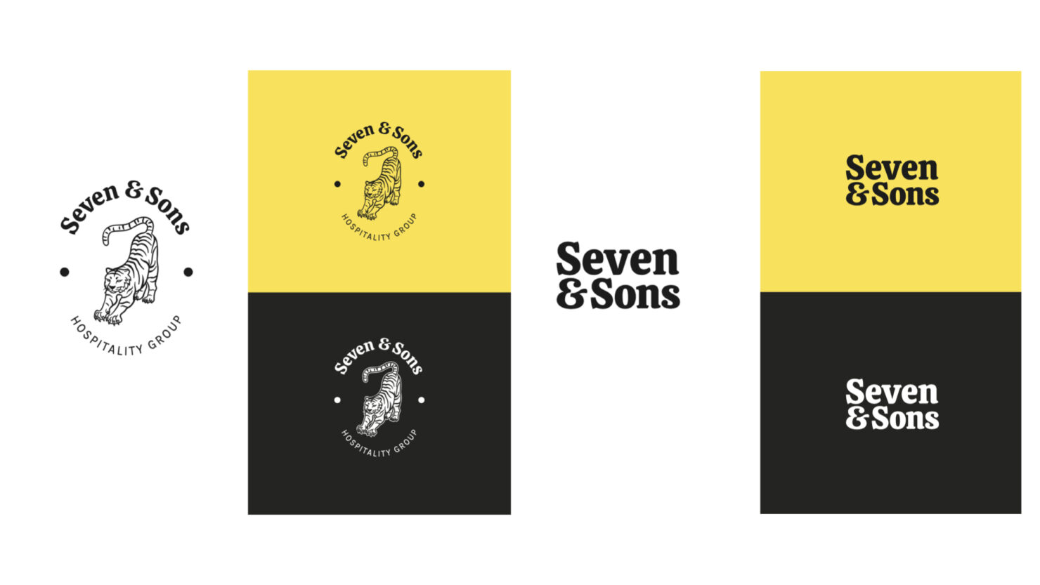
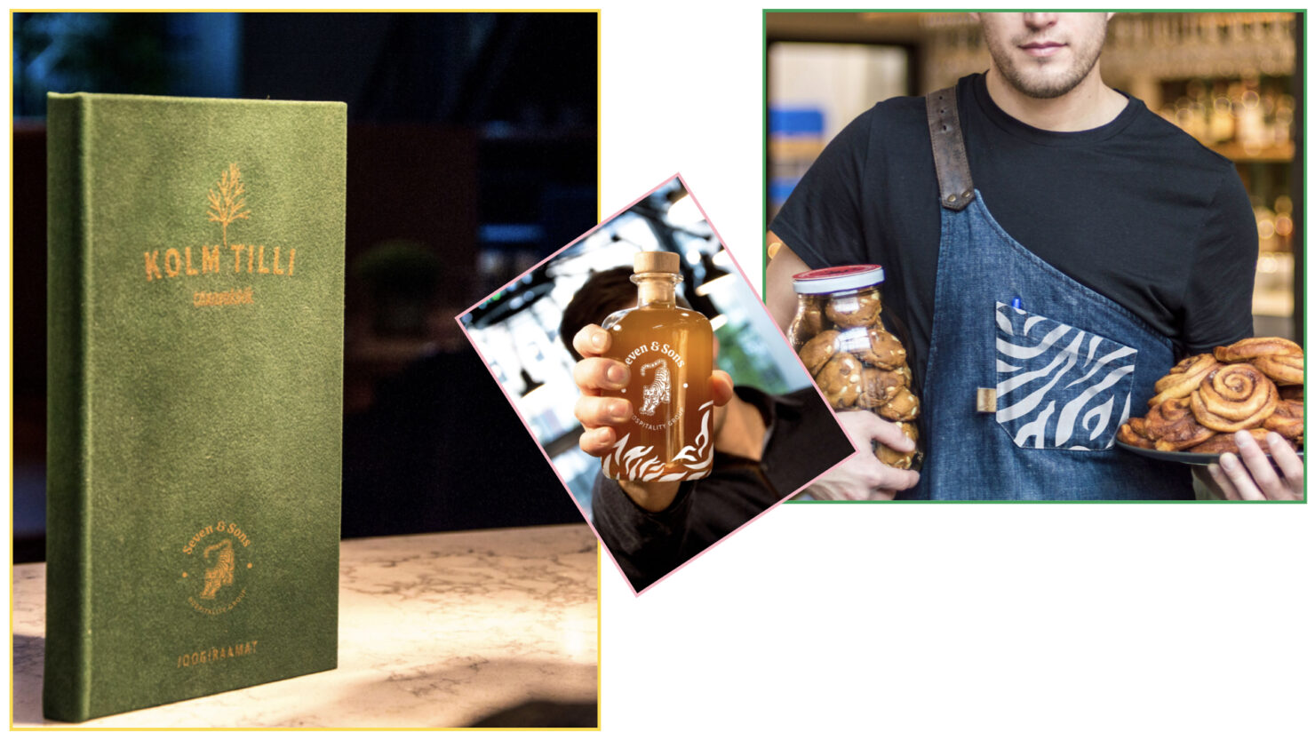
At the heart of the Seven & Sons logo is a tiger. He is strong, but at the same time self-aware and persistent. The logo is inspired by a stamp technique and is looking ready in its shape to mark the direction of the Seven & Sons group. In addition to the main logo, there is a more minimalist (tiger-free) version that can be displayed in small print or on the web.
Same function is performed by the striped pattern, which is used on both the exterior facade and souvenirs.

The brand really came together with sevensons.ee
There, all the bits and pieces found their place and shined as one.
Team
- Keiu Grossberg – Design Lead
- Lauri Sokk – Project Lead
- Kerttu Lumi – Web Design
- Gunnar Hunt – Strategist
- Vahur Vogt – Developer
Partners
- Martin Sõgel, Mikk Valtna, Regeri Zoo, Karl Astok, Hannes Teiss, Peeter Tammur, Joel Ostrat, Lauri Kepler – Seven & Sons