2019 | HansabGraphicBranding
Rebrand for Hansab
There are projects that lack long origin stories. This isn’t bad. Sometimes, in fact, it’s very, very good indeed. This means that professionals have taken over the task on both sides. We do our job accurately, quickly and well. Our collaborators know how to order a project accurately, quickly and well. And they trust professionals (read: us). Such projects with good flow get finished quickly and professionally, and they soothe the soul.
Company had changed, brand had not
When Hansab contacted us, their company had already reached an inner conviction that their branding needs a refresh. The old Hansab logo (you remember, green, shaped like a coin) had served the company honourably for 20 years. During those years the company had grown and expanded from one that mainly offered hardware to the banking sector to a group composed of 10 companies, which offer complete technology solutions, consultations and software development, as well as hardware for various fields. Clearly they had outgrown their old brand coat.
Hansab folk mentioned that the seed of this rebrand was in fact sown by Velvet more than four years ago, when we presented our interesting rebrand idea. This shows just how long an incubation period for an idea can be.
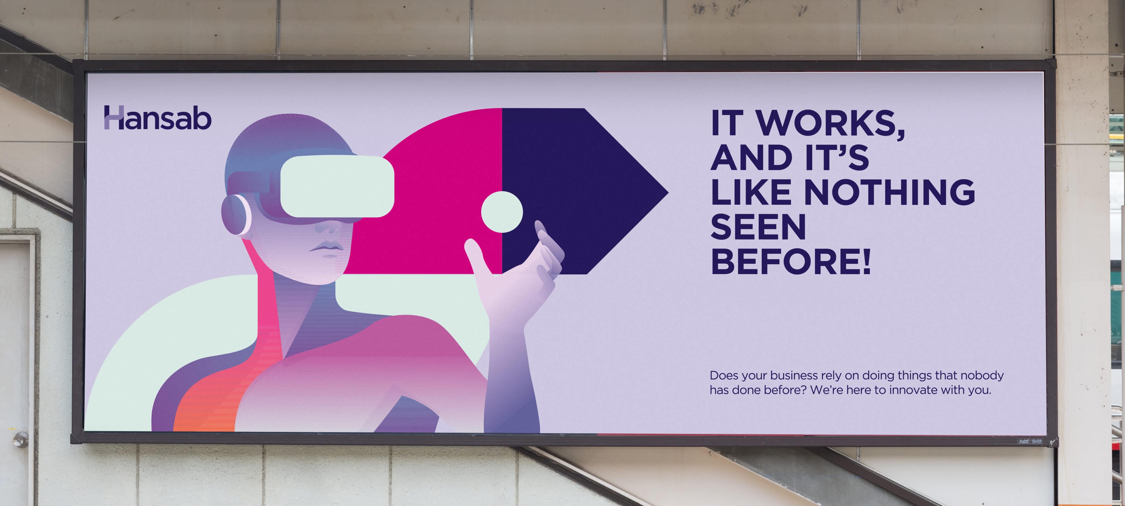
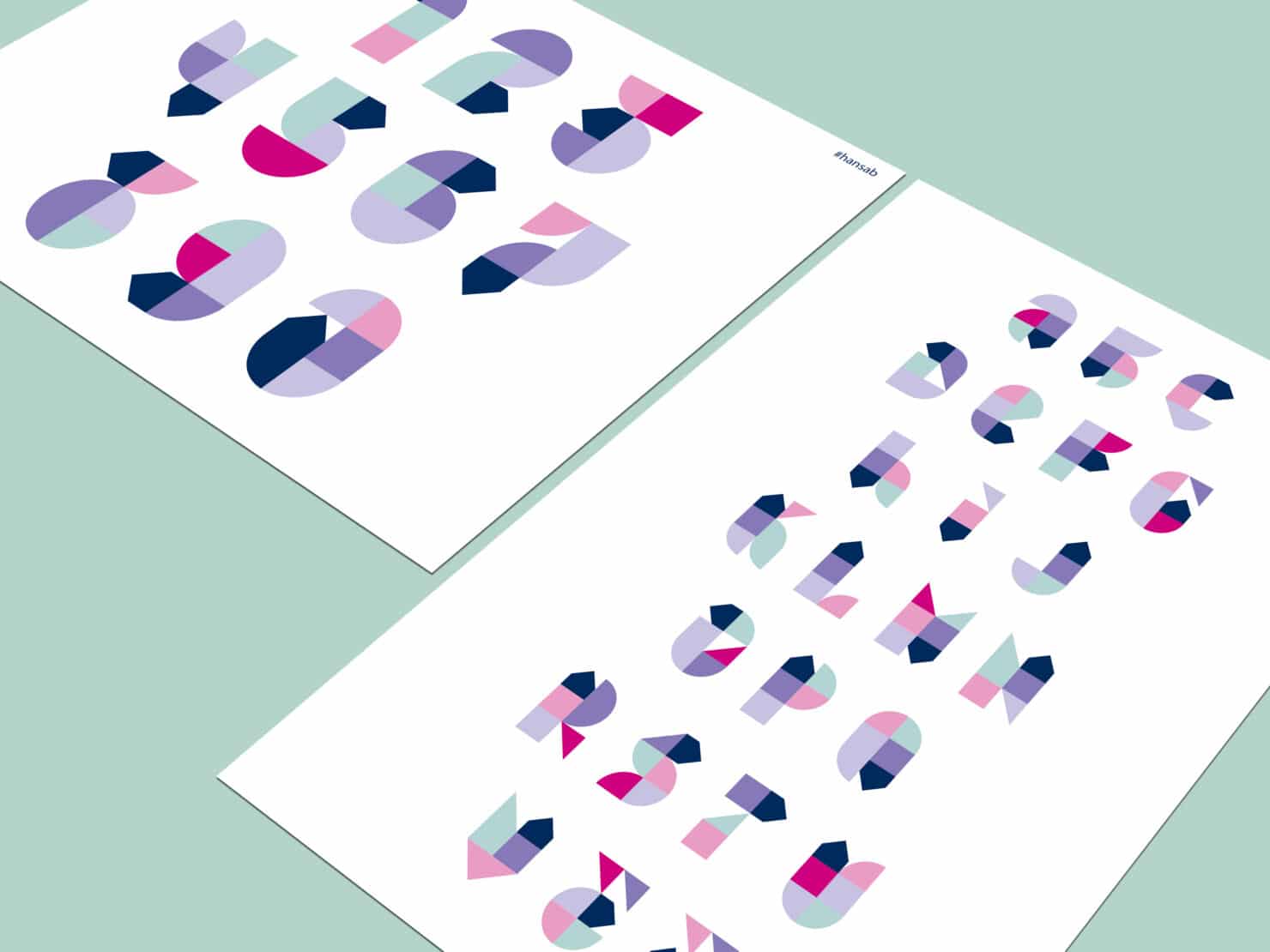
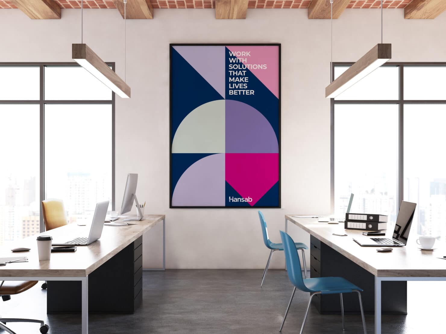
Dynamic arrow as a symbol of progressive solutions
The foundation of the new Hansab identity draws from their commitment to offering progressive solutions. This inspired the dynamic arrow that’s woven into the graphics.
The time was ripe for changes, the changes were embraced
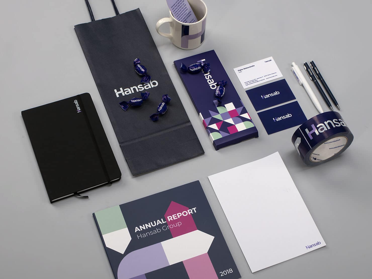
At some point the project leads on the client’s side started to quietly worry that the dark green that’s been seeping into the Hansab-ites DNA during the past 20 years cannot be separated from it with ease. They were surprised by the acceptance; the change was embraced quickly and painlessly. Sigita mentions, laugh lines twinkling at the corners of her eyes, that the stickers used on card payment terminals serviced by Hansab ran out surprisingly quickly. Evidently the servicing teams decided to become real sticklers about marking which machines had been serviced. It would seem that they appreciated the change too.
It’s hard to translate the effects of a rebrand into the language of numbers, but our previous partners have happily reported to us of changed attitudes. The same happened with Hansab. Their team feels more united and positive. The coolest thing that happened though – the rebrand has led to new forward-looking projects.
And now, the cherry on the cake. The leader and fonder and Hansab bought a new car a bit after the rebrand. Can you guess what colour it was? Obviously night blue. A coincidence? Nah, somehow that doesn’t seem likely.
Team
- Kristian Kirsfeldt – Creative Director
- Siim Tikk – Designer
- Alan Reiss – Producer