2019 | Miina Härma GümnaasiumGraphicDigitalStrategicWebsiteBranding
Miina Härma Gymnasium’s brand refresh
or how the next generation taught us that conservatism isn’t bad.
Miina Härma Gymnasium (MHG) is special. Founded in 1906, it’s our nation’s first gymnasium where lessons were taught in Estonian. Before MHG secondary education was available only in German or Russian. If you (or, as it happened, we) are tasked with refreshing the visual identity of this school, there is one thing that hits you immediately like a ton of bricks – the responsibility. More frivolous folk might jest: “There’s no need for all this drama, after all we’re only talking about a logo and some colours!” It isn’t as simple as that though. First, you’re messing with something that’s part of the identity for a thousand people. Second, a brand is never just “a logo and some colours”.
Symbols from a previous century, school from this (maybe even the next) one
The school mentioned that the feeling that the symbols need sprucing up had been growing louder over the years. The old symbols were drenched with the heavy air of the previous century, which was long gone from the halls of the school building itself. Before contacting professionals they prepared the soil. There were many discussions, many conversations. Smart! It was easy for us to take it over from there. We did have to explain to the school’s representatives that we can’t start this project with designing the logo and the website; that we need to start by viewing the bigger picture first.
Students took the subject seriously
As always, to get the bigger picture we needed to have some discussions of our own. With students. With teachers. With alumni. After the bigger picture was clear, we tried a few different routes to create the logo and other elements. Some of the routes we picked were dead ends. On one of them – and we mark our foreheads with ash for this – we ventured too close to a fierce competitor, Hugo Treffner Gymnasium. Another route – and one which came as the biggest surprise to us – showed us that the most conservative of our interest groups is the one comprised of… students. Their conservatism didn’t manifest itself in backward thinking, it was a proof how serious they are about their school symbols. We’d picked a route that felt too trendy, the students felt it was lacking an air of conservatism and refinement. For a moment we even felt a bit stuck, but as the school folk later emphasized, even that was good. It gave a chance to think things through. Every brand refresh could benefit from this line of thought. School director Ene Tannberg implores all, who plan on getting a new brand: “Accept the fact that you cannot get a good brand in three months; it’s a long process. Take time to polish the results, as this will make you happier in the end.”
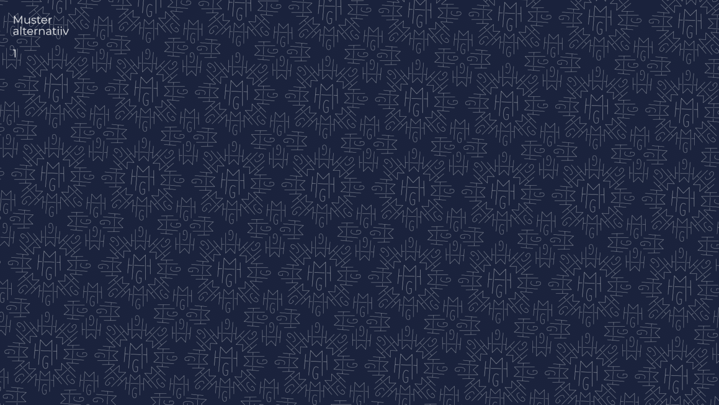
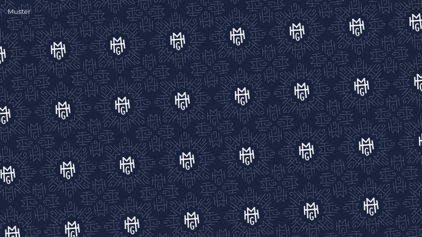
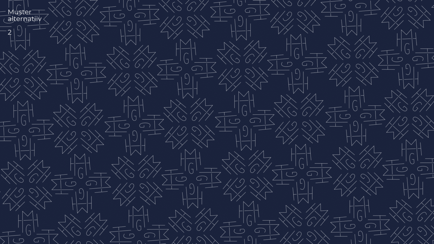
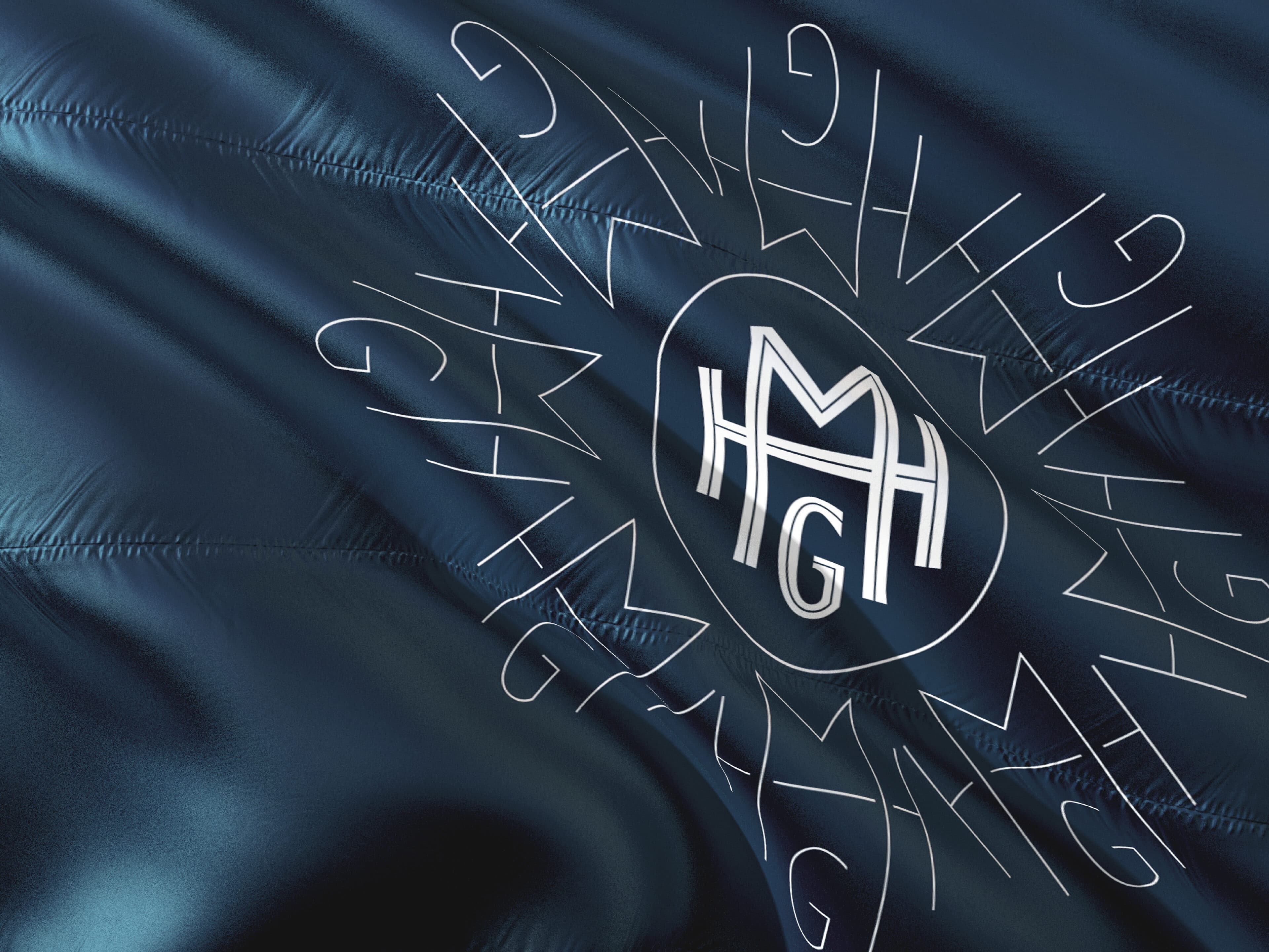
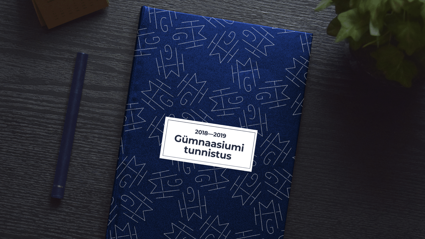
Octagonal pattern, combining the past and future, melted hearts
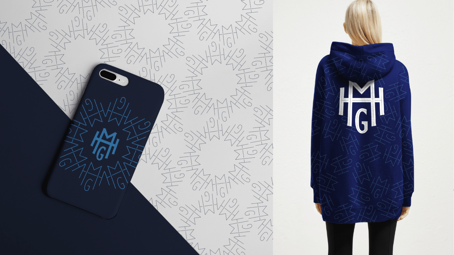
Finally we found the one! We went back to the roots; the solution is ripe with the dignity of the beginning of the last century. Back in the day gymnasiums got their symbols from acronyms of their name. This is a good method that shows clearly, which school is which. We tested a few of these and picked out one that felt the most harmonious and that was easiest to read. The symbol, created from the acronym, led to the graphical pattern. Creating patterns is a true treat for our designer Kaarel. He says: “Patterns are steeped in pure mathematics and symmetry. Math is beautiful.” Kaarel managed to also represent a good portion of semantics in the MHG pattern – nationality represented by the singing mother Miina Härma, modernity, the past and the future. And a lot of math. This was the cherry on the cake, since MHG’s next challenge is finding a way to distance itself from its reputation as a humanities-focused gymnasium. Ene Tannberg adds: “This traditional octagonal pattern melted everyone’s hearts. This feels like our school. On the one hand it’s modern, on the other it draws from Estonian national culture.”

Cooperation broadened the school’s work
Even though the creators themselves were a bit nervous before unveiling their handiwork, the school received it well. We did the necessary work, prepping thousands of slides – some for students, others for teachers or alumni. A positive reception was prophesised by a shirt sporting the new symbols, which went for a wander around the school on the back of a model. It unleashed a flurry of questions of “I want one, where can I get it from?” The director’s words about our collaboration made us very happy indeed: “We received more than we could have hoped for. This collaboration taught us things we’d never even noticed before. We didn’t know how to notice them. Now we see ourselves with more clarity. This helps us plan the future of our gymnasium, since we’ve seen the bigger picture. It was brilliant.”
Did we do justice to the responsibility we were entrusted with? Our hearts say yes but we guess only time can tell. PS. We also have a funny story. One of those stories which make you cry as they happen. MHG ordered 1400 pencils with their new symbols for Estonian Mother Language Day. Everything went well, they got ready in time and we shipped them off. The day before the Mother Language Day the project lead Kadi Anni noticed something off about the pencils. Something, that brought tears to her eyes. There was a typo in the name of the school – Miina Häärma. In the name of the school! On Estonian Mother Language Day! Don’t ask us how this happened, we honestly haven’t got a clue. Ene Tannberg remained admirably calm when she heard this and quipped: “No worries. They still write well.”
Team
- Janno Siimar – Design Lead
- Kadri Ann Mikiver – Producer
- Kaarel Vahtramäe – Art Director
- Ken Oja – Art Director