2023 | Eesti PankGraphicBranding
Eesti Pank brand expansion
how modest measures can get you far
As a central bank of the euro area, Eesti Pank (Bank of Estonia) is a dignified organisation with a dignified brand and rich history.
Their efforts contribute to the sustainable development of the Estonian economy and to the increased prosperity for Estonia by keeping inflation as moderate as possible, the financial sector stable, and cash circulation functioning.
There’s no need to rebuild what is already working. Consequently, we did not set out to reinvent the wheel or create a whole new brand for Eesti Pank.
However, over time needs become more precise, environments develop and mediums change.
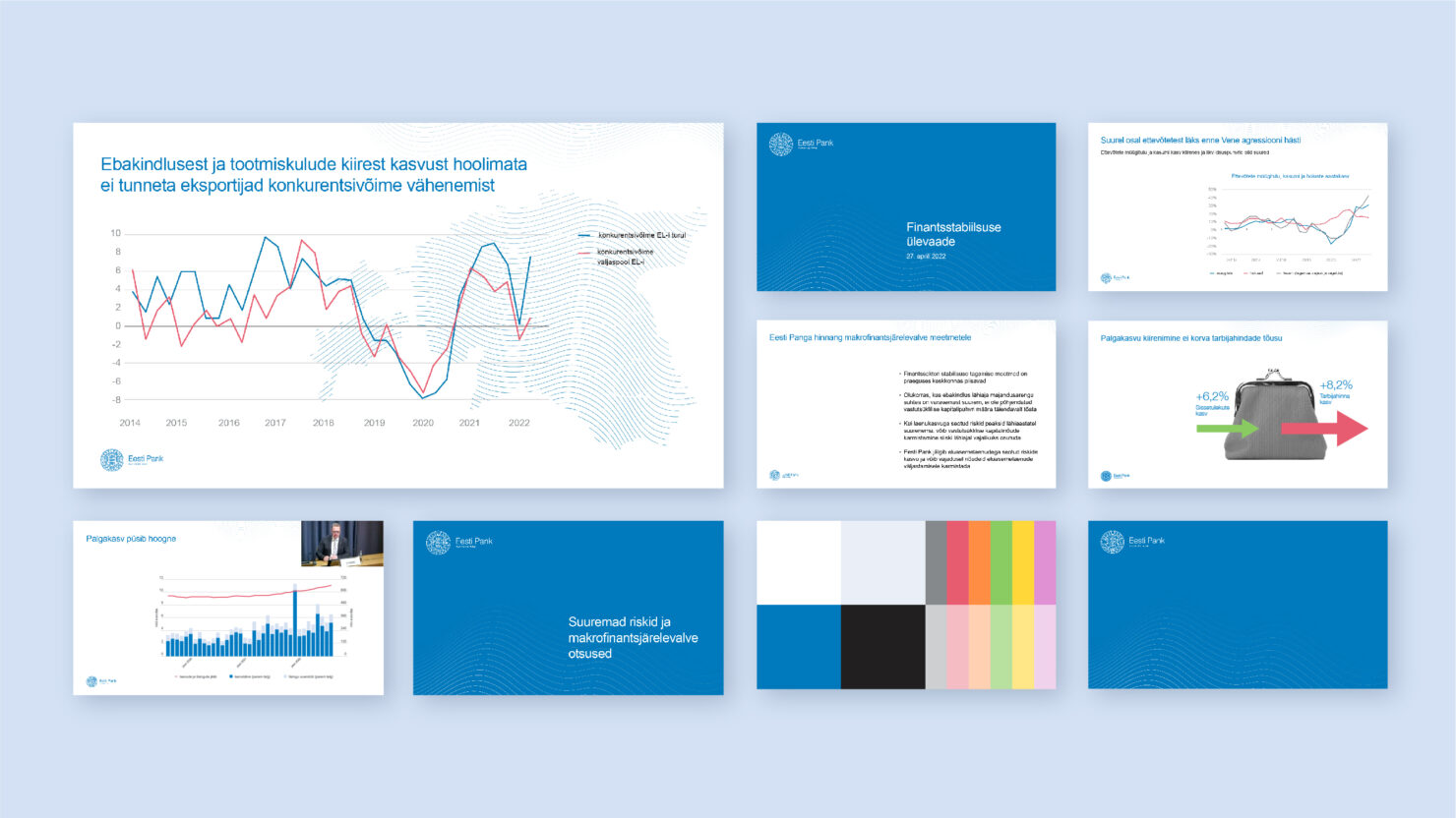
That’s where we came in. To make the brand easier to use and to supplement the brand’s toolbox with as simple and clever tricks as possible, we
- reviewed the tools and materials in use so far;
- adjusted the existing logo design to function on more different formats and mediums;
- updated the color palette and system, which leaves a wider playing field for making graphics;
- established principles for infographics;
- established principles for social media visuals;
- established principles for photography style,
- and conducted an infodesign training day for the team.
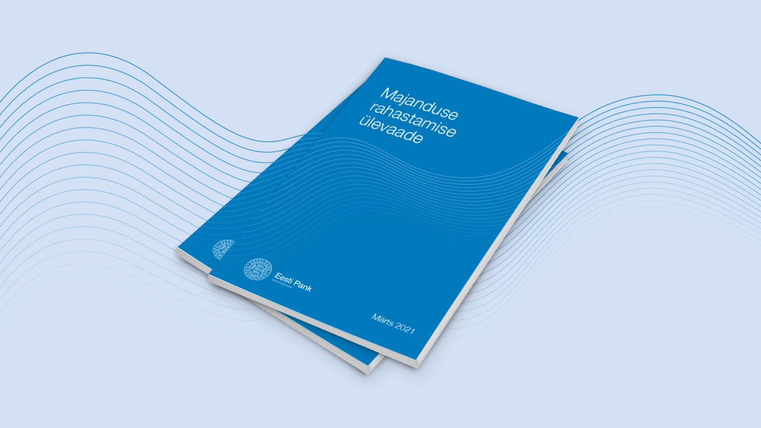
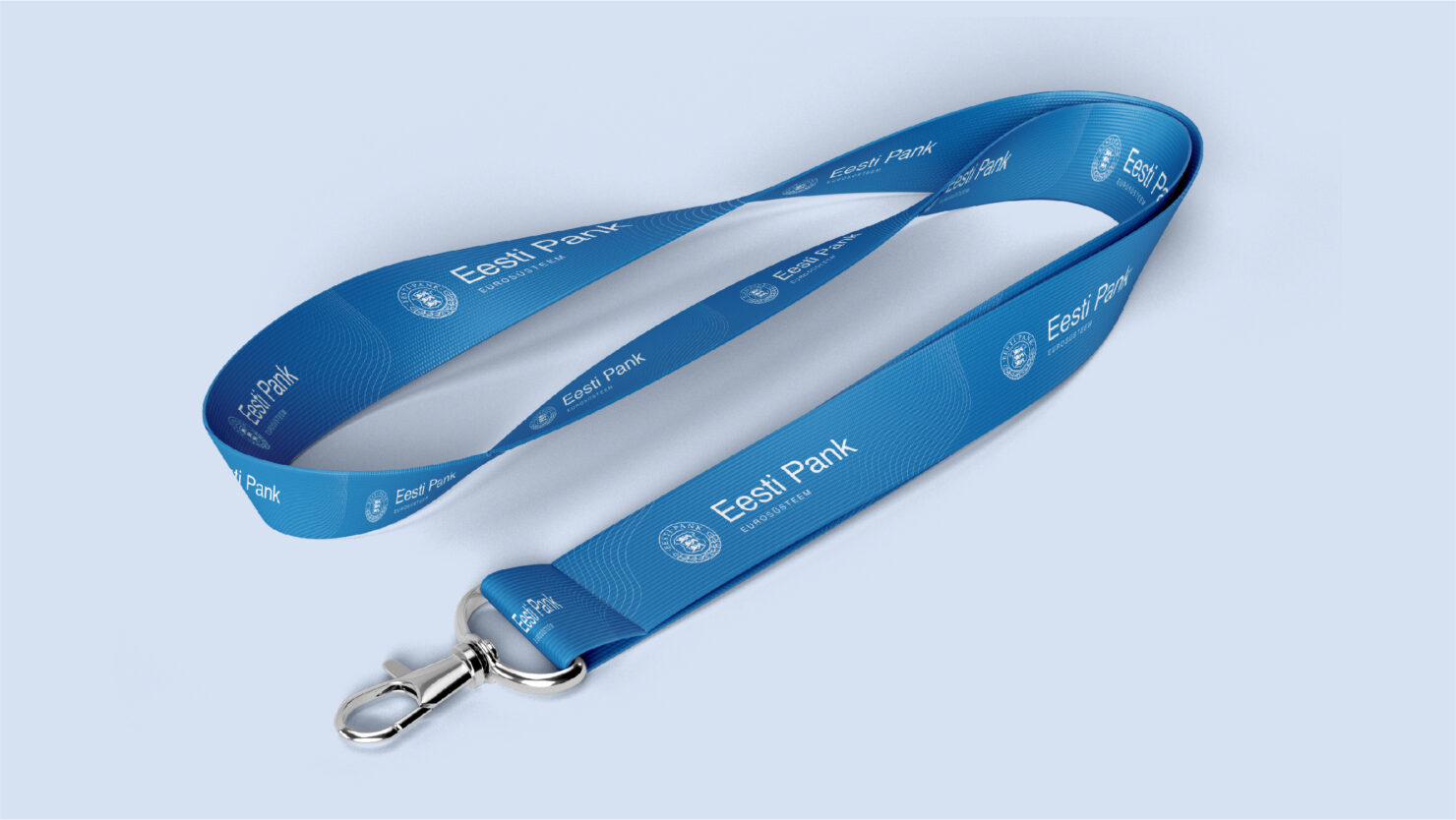
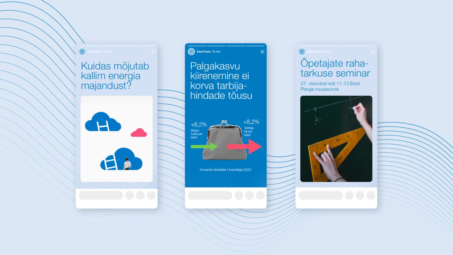
Through these adjustments, Eesti Pank achieved a sleeker and more modern appearance and gained a toolset that is user-friendly for the team and enables the economists keep their full attention on econimics.*
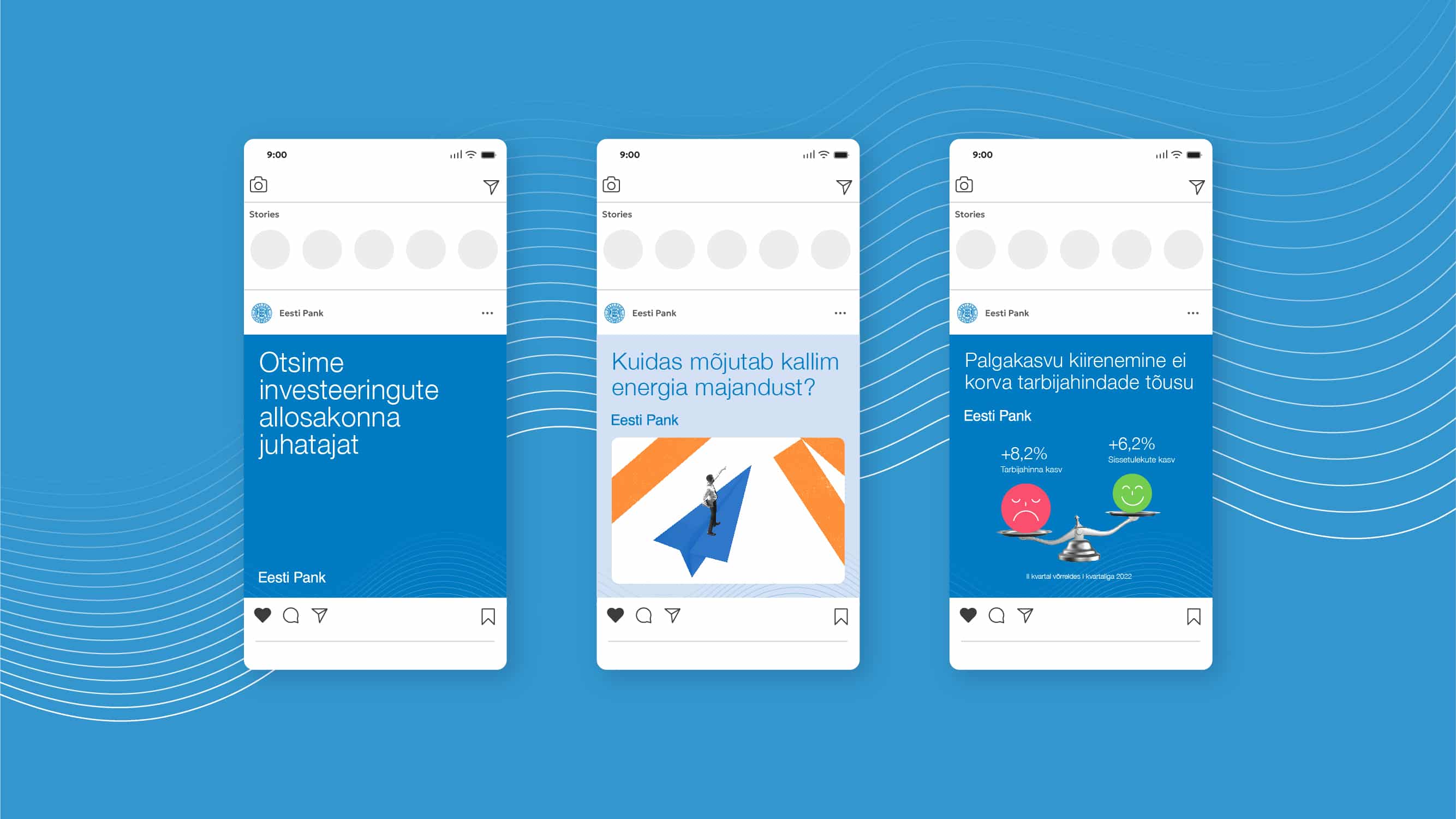
*Disclaimer: the focus has always been on econimics. This is just Velvet trying to sound catchy.
Team
- Kristian Kirsfeldt – Creative director
- Keiu Grossberg – Graphic designer
- Nele Volbrück – Producer
Partners
- Eesti Pank (Villu Känd, Gerli Rauk, Indrek Pärli, Triinu Talve) – Client's team