2019 | Suure Jaani TervisekodaGraphicEnvironmentalInterior GraphicsWayfinding
Brand and signage of Suure-Jaani Tervisekoda
or how we dotted the i’s.
After we’d had a bit of time to study the plans and designs of architects and interior designers, which the director of Suure-Jaani Tervisekoda sent to us with their request for branding quotation, we were immediately sold on the project. Such a building! In such a tiny place! My god! Of course we wanted to play part in this project! This led us to create a brand and signage for the spa and family health centre, which are housed under the name and roof of Tervisekoda (health hall).
How to complement the architect’s creation?
Sometimes you have to work hard to find the spoonful of sugar that provides the inspiration in a project; the Suure-Jaani project on the other hand offered our creative brains enough of sustenance. The architects had created something unbelievably good. We puzzled over how to add something that would stand out and speak in its own way, but wouldn’t try to play first fiddle. Soloing would not be fair to the architect’s handiwork.
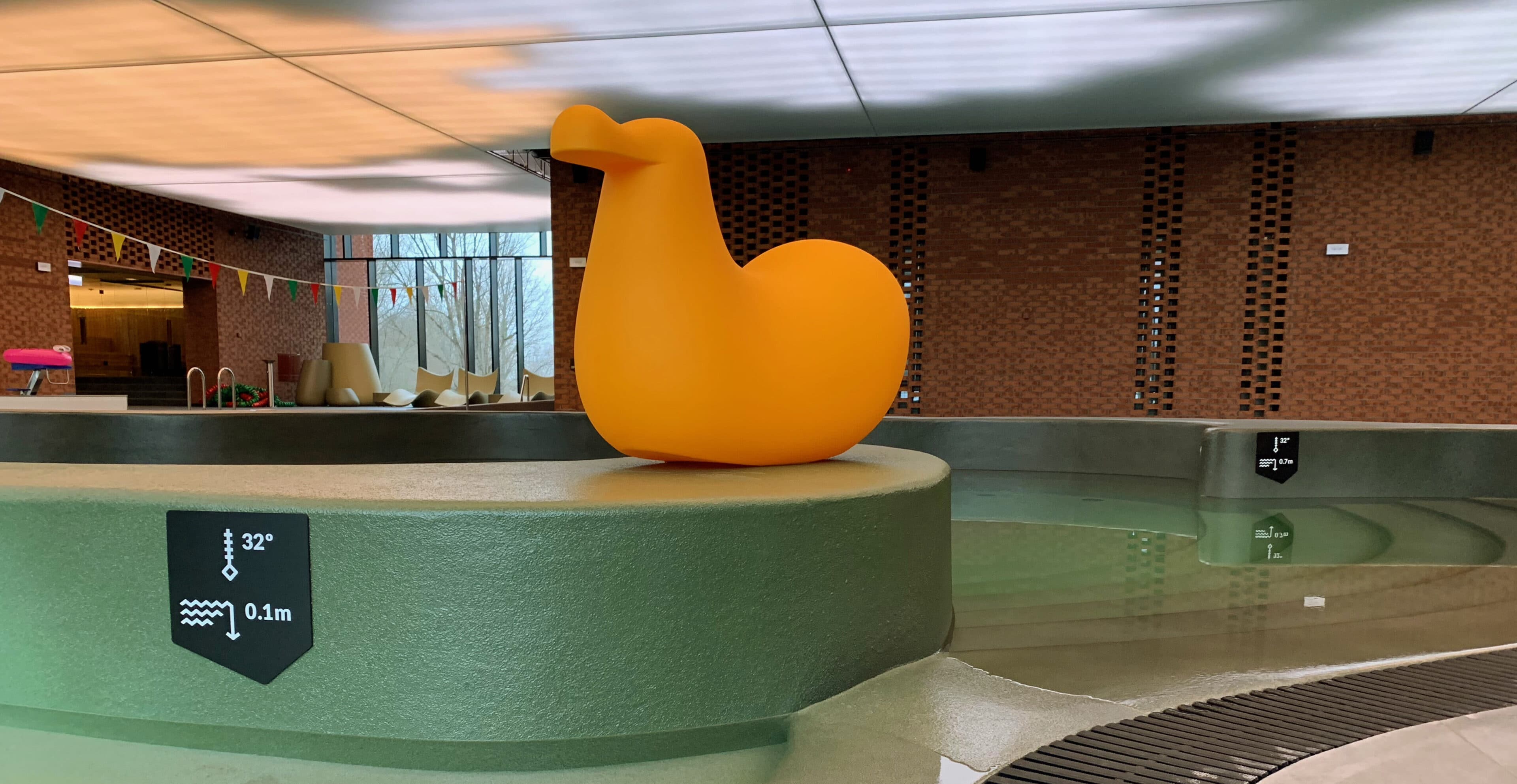
We followed the theme the architects set. Since Suure-Jaani is situated next to the Soomaa National Park (the lovingly titled Land of Bogs), the architects drew inspiration from its nature and its fifth season (a name given to Soomaa’s spectacular spring floods). We followed in their tracks until we came to a crossing of two paths. One of these took us straight into a mire (we got bogged down, if you will). This taught us a valuable lesson on the power of words. Interior designers had planted pools like tiny lakes into the landscape of the spa. We loved both the idea and the colour scheme and translated it into the language of graphics. It turned out so beautiful and unique, we were very pleased. We presented it under the name of “Laugas” or bog eye. However… A lot of people associate this with something rather sinister. This negativity shaded the whole graphic solution and it was quickly removed from the table. We should have stuck with the lake imagery. Next time we’ll know better.
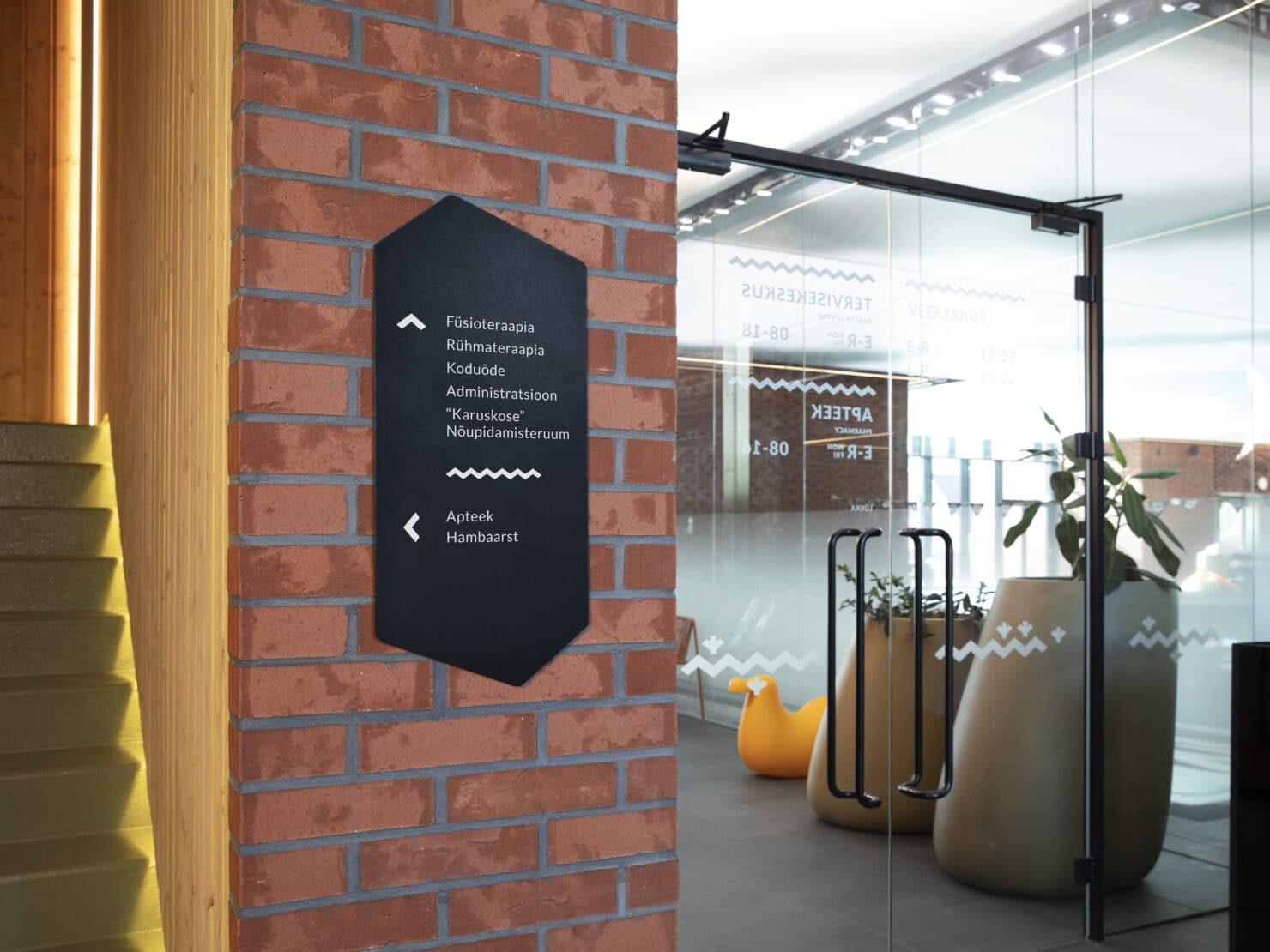
Shape of the building combined with elements of topographic maps
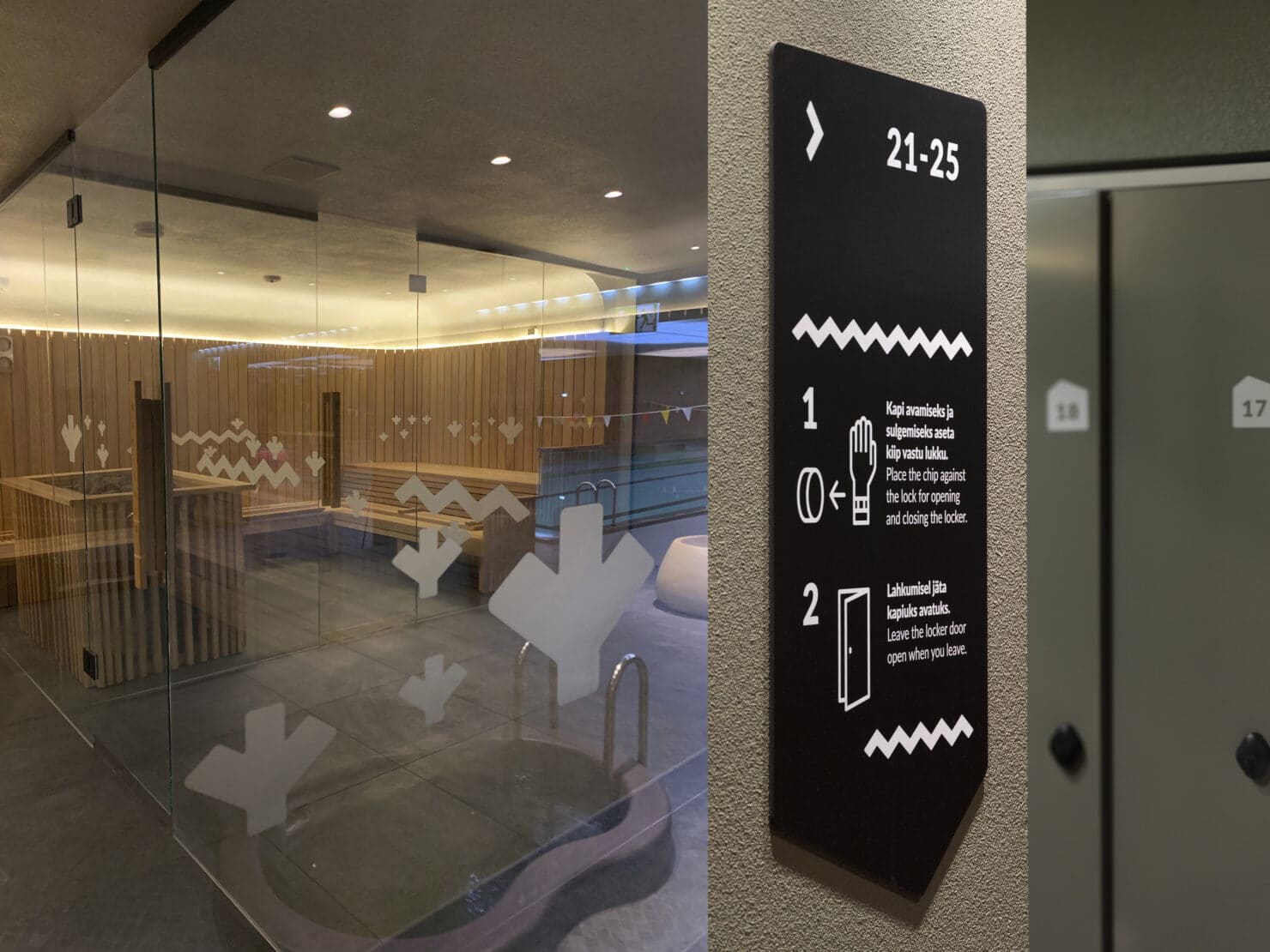
We weren’t saddened by the other option that was left on the table. It too was deeply rooted in the architect’s work. We borrowed the shape of the gable from the building itself and used it as the logo and the foundation of their signage. The gable carried allusions to the brand name, to “koda” or hall. We filled this hall with symbols of Soomaa, or rather with the graphical elements drawn from a topographic map of a bog landscape. Interior designers provided us with the clay tones. This might have been where this collaboration ended, with everyone pleased. We were so in love with this project that we continued to polish it for some time. We simplified the logo a lot. We think it turned out pretty great.
Signage that engages rather than accosts
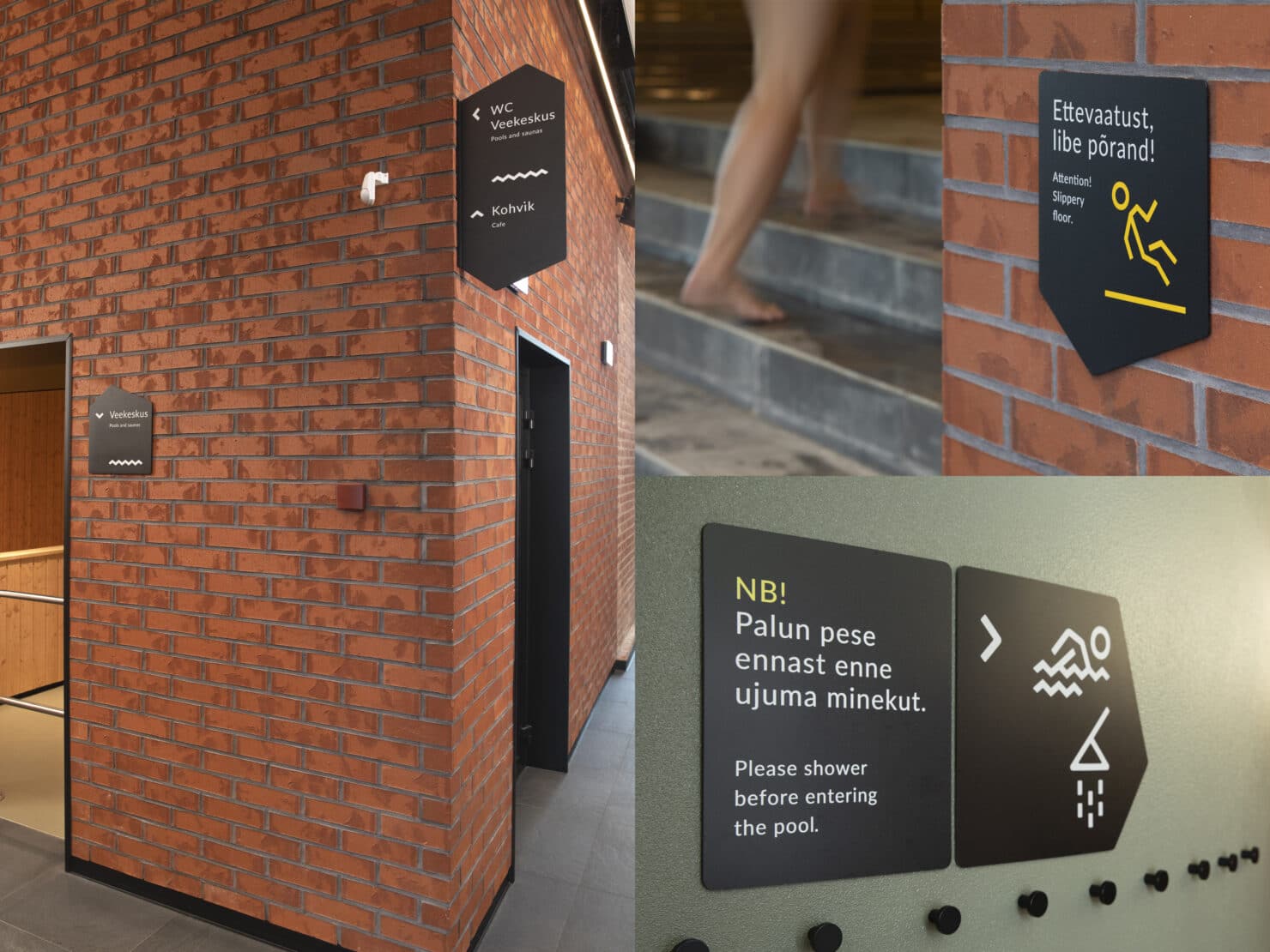
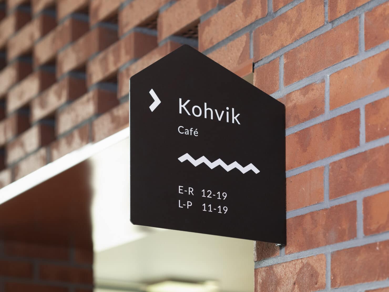
We followed this by creating signage. We had a suitable form, which matched the interior. On our first introductory visit to the building, it gave us exact directions and instructions, so we didn’t have to grapple long with getting the colours and materials right. The whole set worked. It came almost as an afterthought, how well the black signs work with red brick walls. On the one hand they form a unified whole, so the signage doesn’t yell over the rest of the room. On the other hand the powerful black stands out enough that the signs function as functional signage.
We learned a lesson (luckily it wasn’t too painful) when we created the signs. We thought we’d do a bit of original design work, create a few cool pictograms, because who wants to see the same old triangles marking the different sexes everywhere? We drew different characters of cool women and men on the respective washroom doors. It turned out that it doesn’t pay to meddle with these things. The older ladies ended up in men’s washrooms by accident, because our long-haired man-pictogram left too much for interpretation. By now this minor mishap has been cleared up and no more worrying news from Soomaa’s neighbourhood have reached the capitol.
Valued by visitors
When we asked the director of Tervisekoda for comments for this story, like hi, how would you summarize the results, etc., no long discussions followed. We found out that nobody is complaining about anything and discounting the mishaps with the old ladies, everybody finds what they were looking for. That’s one of the paradoxes with signage. You don’t notice it when it’s done well, you notice when it’s missing. Other than that Tervisekoda is doing just fine, the water park has been full of swimmers since the opening. What else to wish for a forward-looking company?
This was the story of one of our loves. Turns out that others love it too. The 2019 Estonian Design Awards jury awarded Tervisekoda signage a gold prize.
Awards
- ADC*Estonia – Wayfinding Design (Gold)