2021 | ApothekaInterior DesignGraphicEnvironmentalRetailBranding
Apotheka
One of the first stores to merge its new brand and the brand of Viru Keskus shopping centre in a coherent experience.
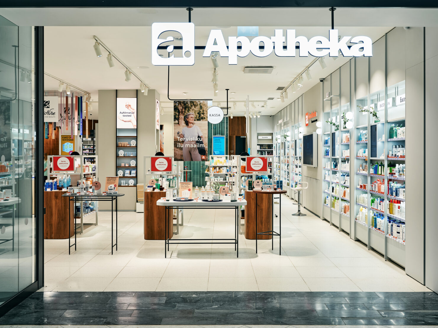
Apotheka’s renewed brand is clean and simple, so it makes communication between the customer and pharmacy more understandable.
In the physical store, we added some simple notes and recommendations next to products. So pharmacist’s wise words and friendly tone are also findable even without physical contact.
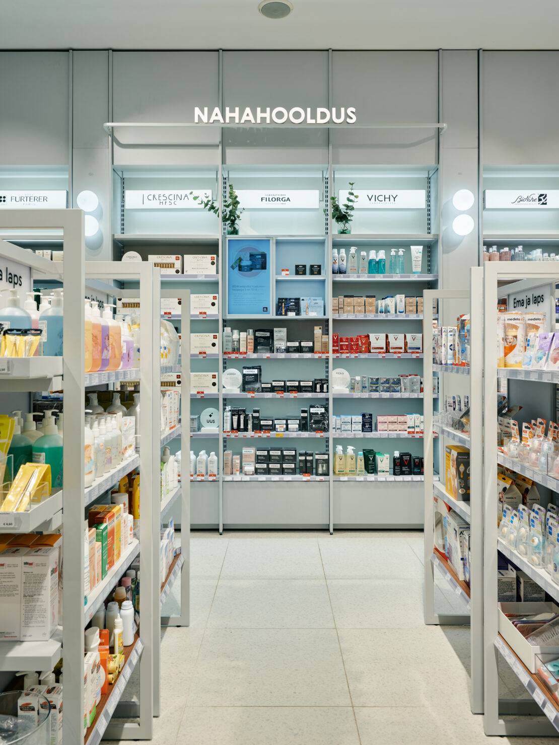
All the messages are illustrated by simple icons and in beauty section, customers can find explaining graphics that give some additional information about the brand and its origin.
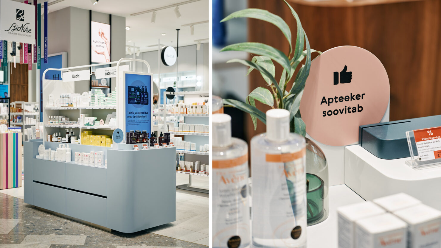
Photographic language and illustrations are not so much about medications. They are showing bigger picture behind one’s good health. It’s all about the right lifestyle.
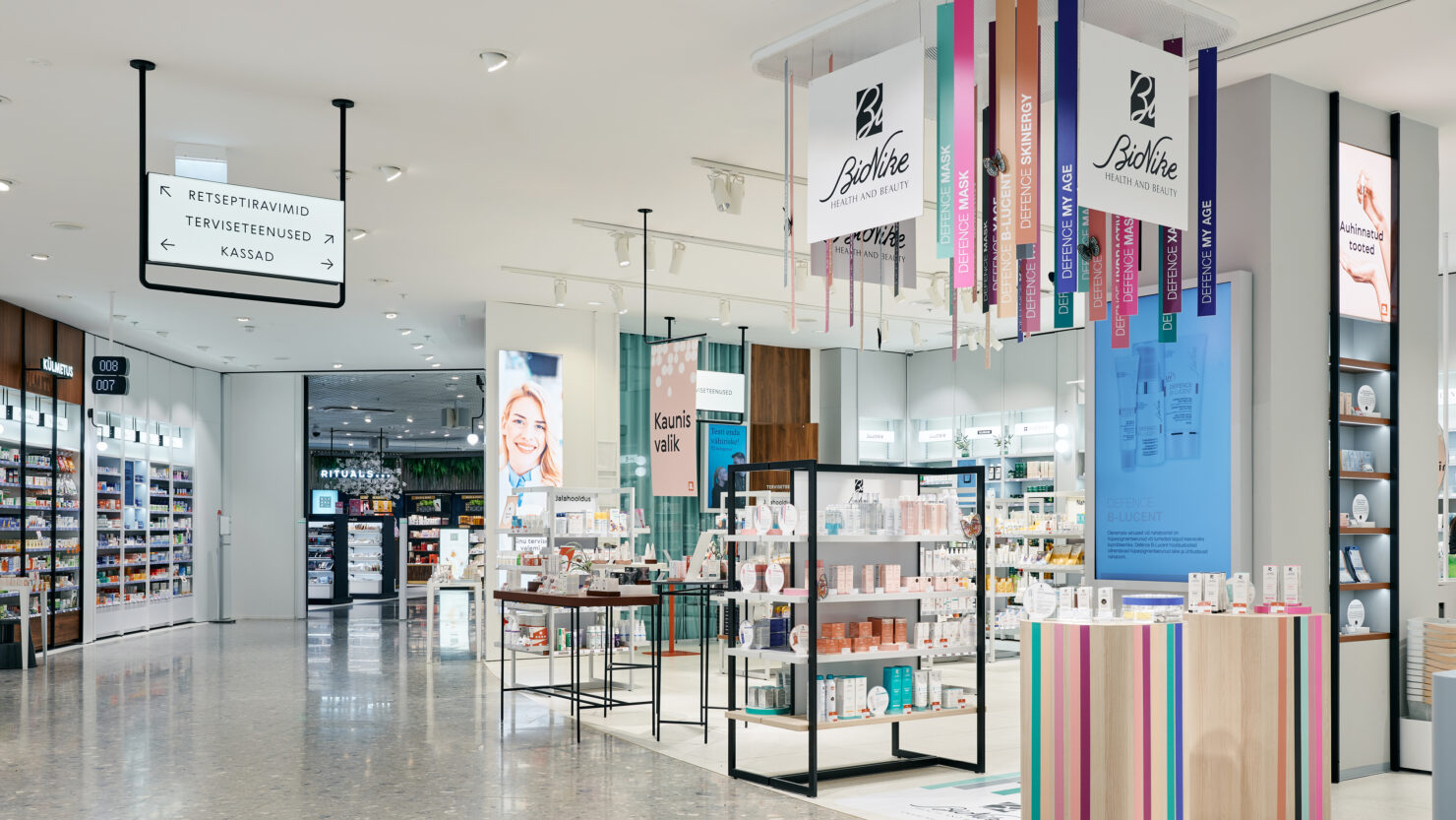
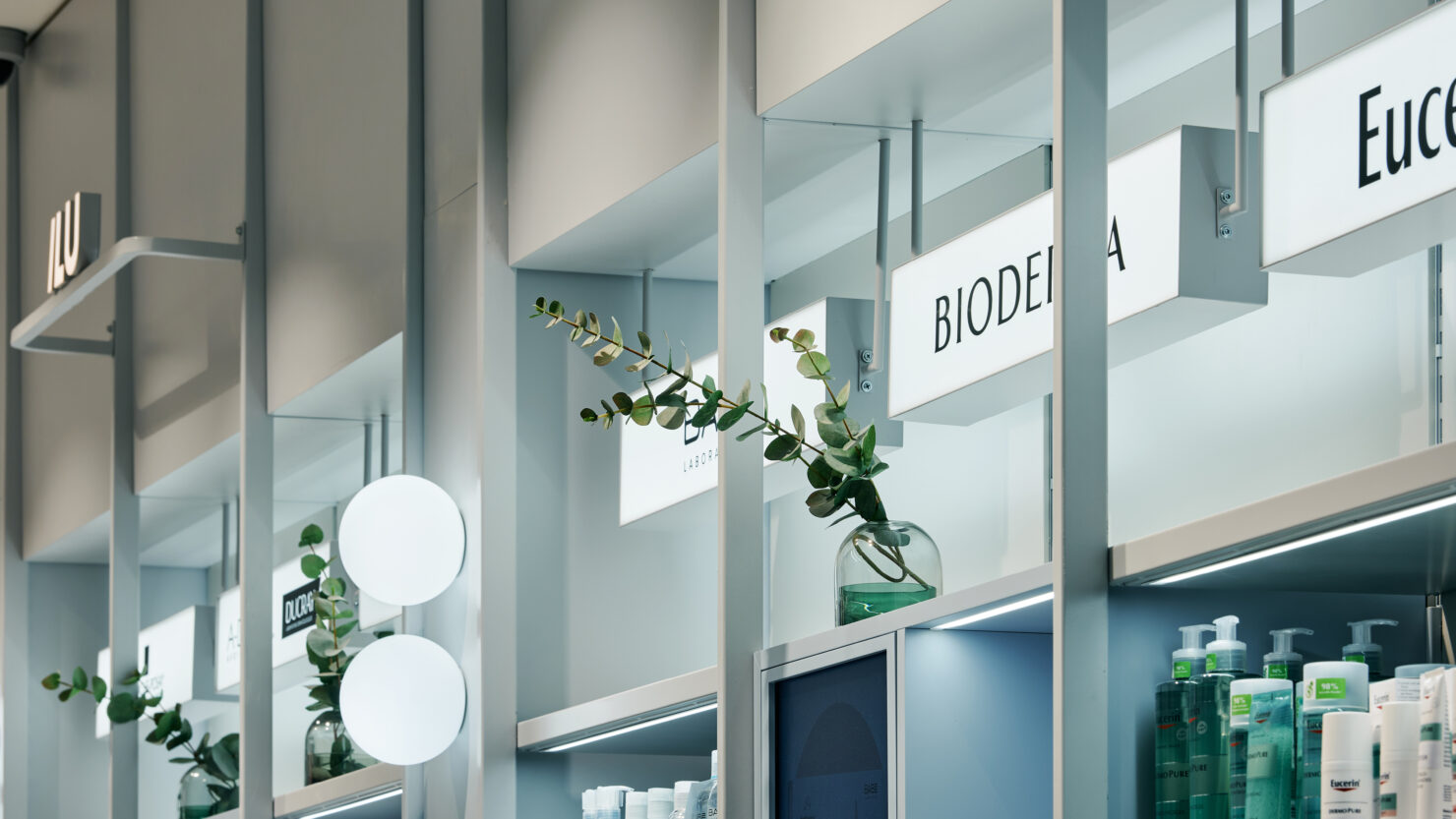
Functional wayfinding system is as clear and simple as the branding. All the categories and signs that are located in higher area of the room, are lighted. All guiding signs are following good contrast and black & white visuals. Wayfinding system steps apart from smaller graphics and visuals to make finding the right product easy and fast.
Apotheka pharmacy at Viru Keskus was first in so many ways.
The first pharmacy to be opened after its brand renewal. Also the first pharmacy with the new concept of providing traditional pharmaceutical products, larger beauty section together with a range of health services that used to require considerable effort. And also one of the first stores to implement the renewal of Viru Keskus shopping centre.
Professional, yet warm and welcoming.
Interior architecture, branding layer and signs are all developed with great teamwork between client, architects and designers.
Team
- Kadri Pukk – Project Lead
- Sandra Goroško – Art Direction & Environmental Design
- Ken Oja – Creative Lead
- Keiu Grossberg – Designer
- Gunnar Hunt – Copywriter
Partners
- AERIS (Kätlin Ölluk, Alina Undusk) – Interior Architects